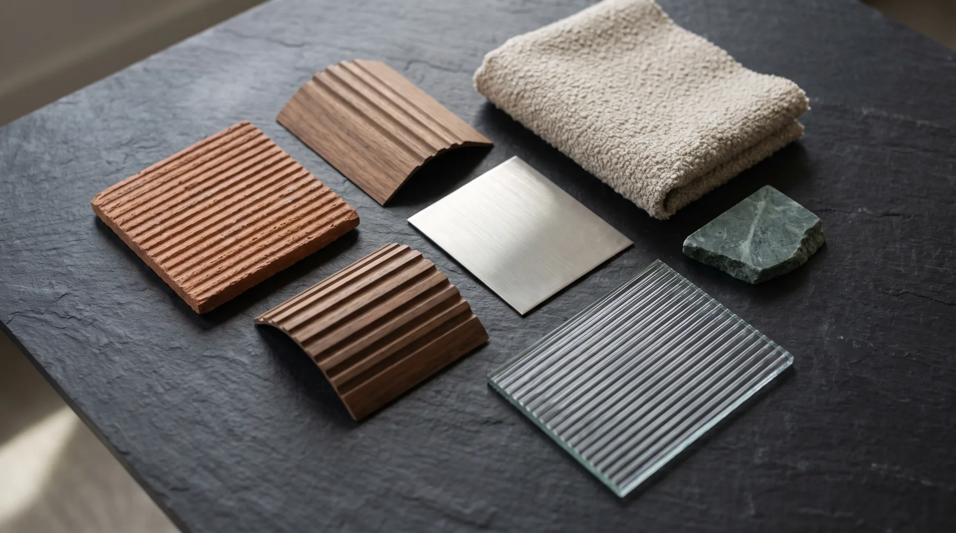
This page explains what each map does, what separates a good material from a poor one, where free PBR materials come from and what their licenses allow, and how we build a material from a manufacturer's finish when a library version is not close enough. It is written for designers and buyers who want to brief a render, and for artists choosing a library.
What is a PBR texture?
A PBR texture is a group of image maps, each storing one physical property of a surface, that a physically based renderer reads together to shade that surface. Most 3D textures sold or shared today are PBR sets, so a download of one wood floor arrives as four to seven image files rather than one picture. In rendering, textures are data, not decoration: a rendering texture for roughness is a grayscale image whose values the engine reads as how sharp or blurred the reflections are. Good rendering textures therefore contain no baked-in shadows, highlights or lighting, because the renderer adds those itself from the scene.
What does PBR stand for in materials?
In materials, PBR stands for physically based rendering, meaning the maps hold measured physical values rather than painted lighting. An older hand-painted texture might include a highlight on the edge of a tile; a PBR texture leaves the highlight out and lets the light in the scene create it. For the principles behind the maps, such as energy conservation and the split between metals and non-metals, see our answer to what is PBR rendering.
What does PBR mean for textures?
For textures, PBR means each map holds one property, such as color without shadows or roughness as a 0 to 1 value, so the material reacts correctly to any light. The same oak set then works in a north-lit studio, at dusk and under a hot midday sun without being repainted for each scene.
What maps does a PBR material use?
A PBR material uses a base color map, a roughness map, a metallic map and a normal map, often with height, ambient occlusion and opacity maps. Each map is wrapped onto the model with the same coordinates, a process called texture mapping, so the grain in the color map lines up with the grain in the normal map.
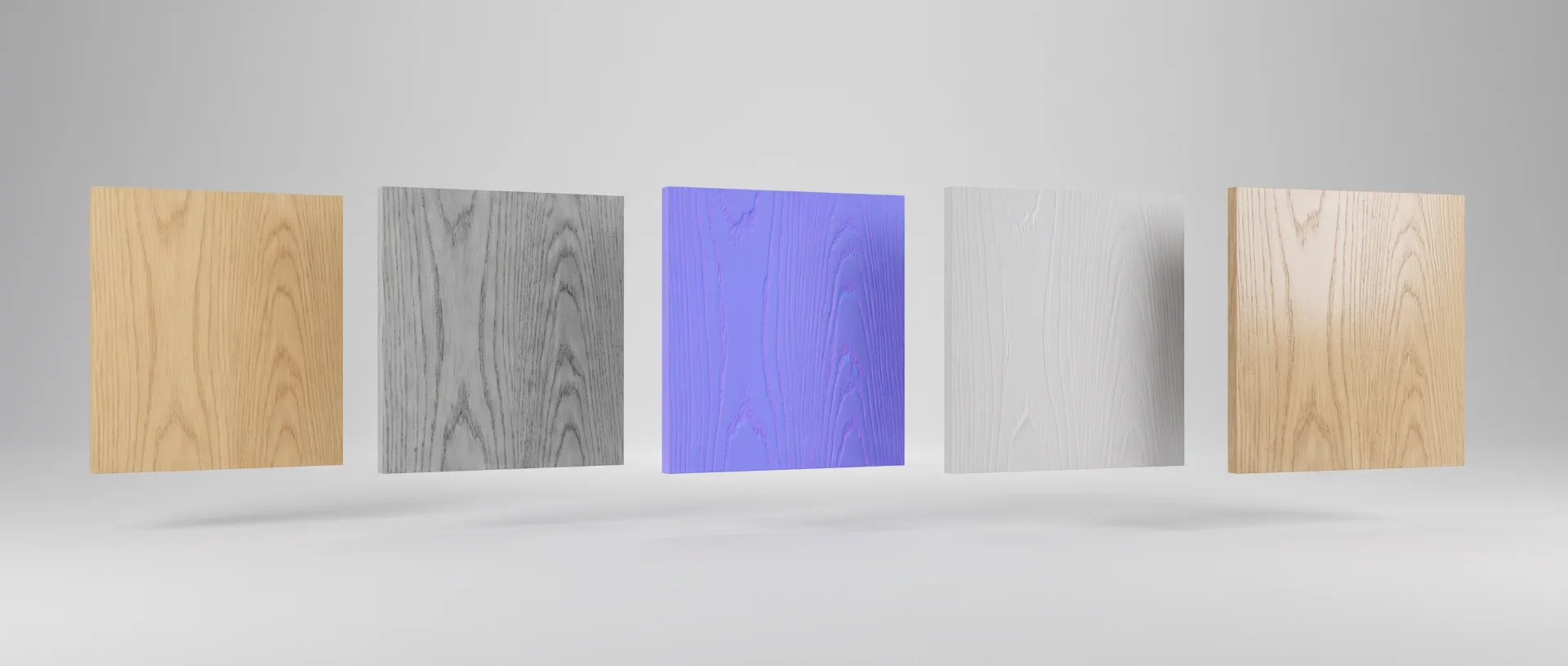
| Map | What it stores | What it looks like | Example on white oak |
|---|---|---|---|
| Base color (albedo) | The surface color with no shadows or highlights | A flat, evenly lit color image | Pale honey wood with darker grain lines |
| Roughness | How sharp or blurred reflections are, from 0 (mirror) to 1 (fully matte). See the roughness map entry. | Grayscale: dark is glossy, light is matte | Mid-gray, slightly darker where the finish has filled the grain |
| Metallic | Whether each pixel is metal (1) or non-metal (0) | Almost always pure black or pure white | All black: wood is not a metal |
| Normal | The direction each pixel faces, to fake small bumps without extra geometry. Our page on normal maps explains how. | Purple-blue image with colored edges | Open pores and grain ridges catching side light |
| Height | How far each pixel sits above or below the surface. A displacement map uses it to actually move the surface. | Grayscale: white is high, black is low | Faint relief along the grain, used only on close-ups |
| Ambient occlusion | Small contact shadows in crevices | Mostly white with dark creases | Darkening inside the deepest pores |
| Opacity | Which parts are solid and which are cut away | Black and white mask | Not used; oak veneer is solid |
A finished white oak floor usually needs only the first four maps. Height is worth its render cost when the camera is close enough to see relief, such as a macro shot of a cabinet door or a brick wall in raking light.
What is the difference between a texture and a material?
A texture is a single image map, while a material is the full surface definition that combines several textures with shader settings such as reflectivity and transparency. When artists talk about 3D materials or rendering materials, they mean the whole package: a texture for rendering color, another for roughness, and the shader that reads both. Render materials also carry settings that no image holds, such as the index of refraction of glass, the thickness of a coat of lacquer or how far light travels into a marble worktop. So textures for rendering are ingredients, and materials for rendering are the recipe that combines them. A material for rendering can even use no textures at all: a plain white lacquer is one color value and one roughness value.
What makes a good rendering material?
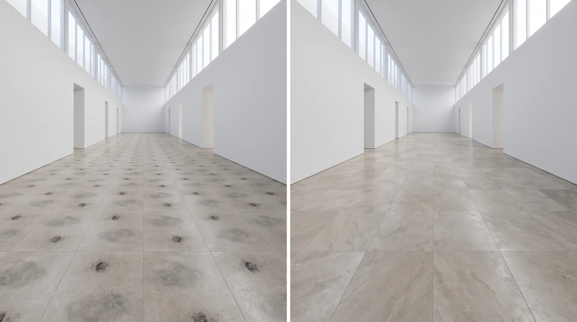
A good rendering material is at real-world scale, tiles without visible repeats, has a believable roughness range and has enough resolution for how close the camera gets. Seamless textures are the starting point, since a texture whose edges meet without a seam can cover a floor of any size, but seamless is not the same as non-repeating: a 6-foot oak tile laid down a 36-foot hall shows the same knot six times. 4K textures (4096 pixels square) are enough for most surfaces seen at room scale; a close-up of a single cabinet front may need 8K, and a distant lawn needs far less.
- Set the real-world scale. A 4K oak texture should cover the width of the real boards it shows, so a 7-inch plank reads as 7 inches in the render.
- Break up the repeat. Mix two or three variations, rotate tiles or blend in a large-scale variation map so no pattern is visible across a floor or facade.
- Keep roughness believable. Real surfaces are never one flat value; a worn worktop is glossier where hands rest and rougher at the edges.
- Match resolution to the camera. Use the highest resolution only where the camera is close, and smaller maps for distant surfaces to keep render times down.
- Remove baked lighting. The base color must be evenly lit, with no shadows or reflections captured in the photograph.
- Test under two lights. Check the material under soft daylight and a hard sun or spot; a material that looks right in only one is wrong.
Which textures work for building exteriors?
Building exteriors need large-scale textures for brick, stone, render, timber cladding and metal panels, with variation so a long facade does not visibly repeat. Texture building work for a facade means more than a good brick swatch: a 130-foot brick wall needs color variation between bricks, slight unevenness in the mortar joints, and weathering that follows the rain, such as darker streaks under sills and copings. Metal panels need small differences in reflection between panels, because real panels are never perfectly flat.
How do we build materials from manufacturer samples?
We build client materials from the manufacturer's sample or spec sheet: the finish is photographed or scanned under controlled, even light, the maps are derived from it, and the material is test-rendered next to the photo until the two match. The maps are authored in 3D texturing software, and the match is judged by eye against the real finish, not against a library version.
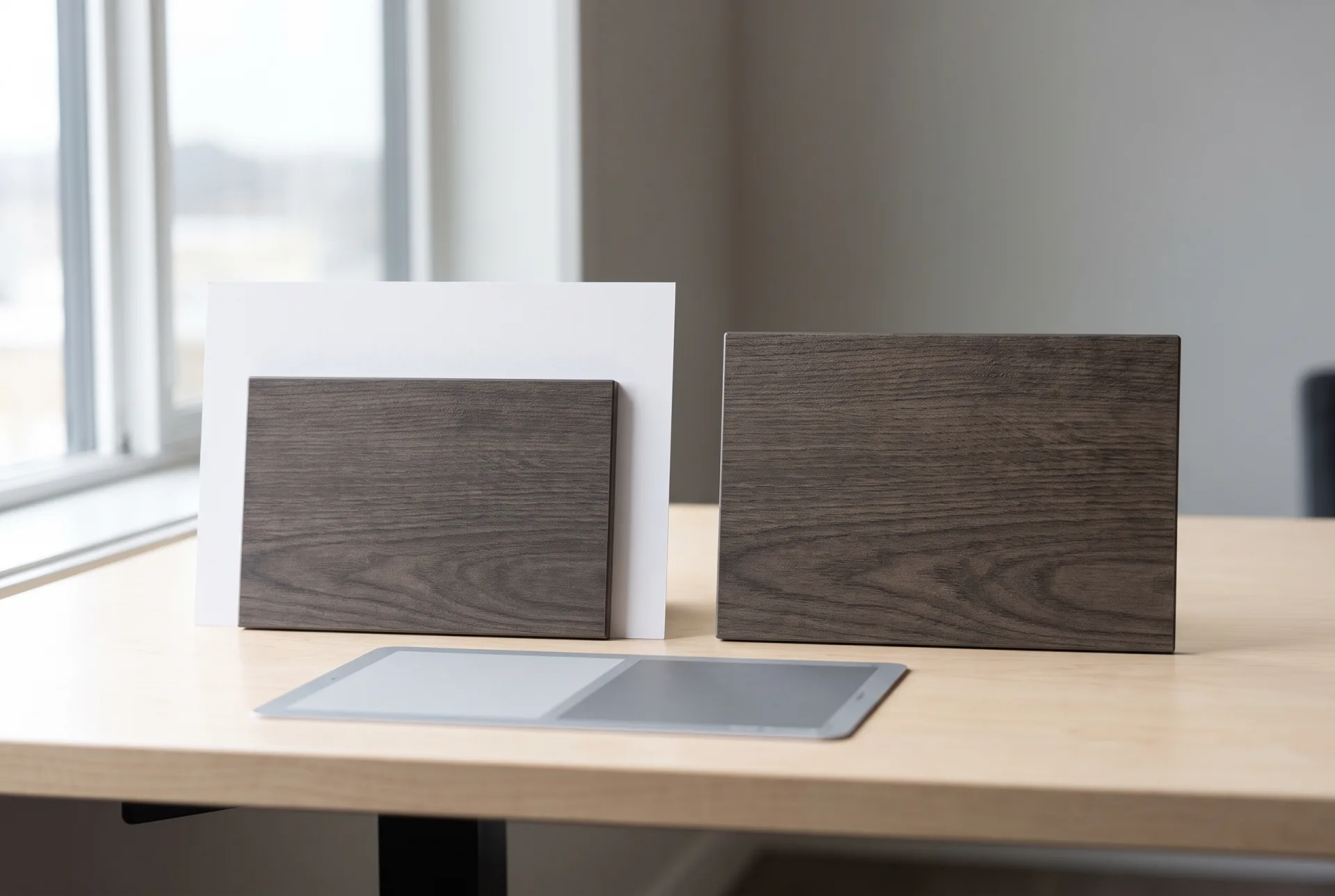
- Collect the finish. We start from the manufacturer's product name and code, its spec sheet, any digital swatch it publishes and photos of the real sample taken in daylight next to a white card.
- Build the base color. The swatch or photo is evened out so no shadow or highlight remains, and its scale is set from the published dimensions of the product.
- Derive the other maps. Roughness, normal and, where needed, height maps are built from the surface: a matte laminate gets a high, even roughness; a textured woodgrain laminate gets a normal map that follows its embossing.
- Test-render beside the photo. The material is rendered on a flat panel under light that matches the photo, and adjusted until color, sheen and texture read the same at the same distance.
- Apply it in the scene. Only after the match is approved does the material go onto the cabinets, floors or furniture in the project.
Where can I find free PBR materials?
Free PBR materials are available from libraries such as ambientCG and Poly Haven, which publish under a CC0 license, and from free tiers of commercial libraries. Free seamless textures are easy to find; the license attached to them is what decides whether you can use them in paid client work.
| Library | License | Best for | Limits |
|---|---|---|---|
| ambientCG | CC0 1.0: copy, modify and use commercially without permission or credit | Wood, stone, concrete, fabric and ground surfaces | Generic surfaces, not specific branded finishes |
| Poly Haven | CC0: any purpose, including commercial work, no attribution needed | Scanned ground, rock, brick and plaster, plus HDRIs | Smaller selection of interior finishes |
| FreePBR | Free for non-commercial use; a paid license covers commercial use; no redistribution | Learning and personal projects | Commercial client work needs the paid license |
| Poliigon free assets | Free license allows personal and commercial projects; no redistribution or use in AI training | High-quality textures to try before subscribing | A small free set; most of the library is paid |
| Megascans on Fab | Free to all only until the end of 2024, per CG Channel; now sold on Fab, with some assets still free | Scanned surfaces at very high detail | Check each asset's terms before use |
Which free libraries are safest for client work?
For license-free use, ambientCG and Poly Haven are the safest choices because every asset is CC0. Nothing has to be credited, nothing is restricted by project type, and a client who later asks where a texture came from gets a simple answer.
Is FreePBR safe to use in paid projects?
FreePBR is a real site that offers free materials, but its free downloads are for non-commercial use, so check the license terms of each asset before using it in client work. Its own terms say commercial use needs its paid license and that files may not be redistributed.
How do textures work in Blender and SketchUp?
Blender and SketchUp both read the same PBR maps: Blender connects them to its Principled BSDF shader, and recent SketchUp versions support PBR materials directly. Blender textures plug into named inputs: the Blender manual describes the Principled BSDF as based on the OpenPBR Surface model, with inputs such as Base Color and Roughness that image textures from tools like Substance Painter can link to directly. For SketchUp textures, the change came with SketchUp 2025, whose release notes introduced Photoreal Materials that accept metalness, roughness, normal and ambient occlusion maps; before that, a SketchUp texture was a single color image and the PBR setup lived in a rendering plugin such as V-Ray or Enscape.
One practical point catches many users: the color map must be read as color, and every other map as raw data. Roughness and normal maps loaded as color are gamma-corrected by mistake, which makes surfaces look too glossy or too bumpy. More on Blender for rendering and its Cycles engine, and on rendering in SketchUp with its built-in tools and plugins, is on their own pages.
Where do free libraries fall short for real products?
Free libraries fall short when the render must show a specific product: a library oak is not the client's oak, so product and furniture renders need materials built from the real finish. A buyer who orders a sofa from a render expects the fabric that arrives to match the fabric in the picture, and a library linen in roughly the right color will not survive that comparison. Product rendering has the same problem with anodized aluminium, colored plastics and printed packaging, where the brand color has to be exact. That is why, at 3DRenderingAgency, a studio with interior designers on the team, we build our furniture rendering from the client's real fabrics and veneers, using the sample-matching process above, rather than from whatever a library offers.